I went to a Hand Lettering workshop by illustrator/designer Steve Simpson last Thursday (October 24th 2013) organised by DPP Skillnet.
In the morning Steve gave an introduction to his work and influences and spoke about how he developed his unique and instantly recognisable style.

Steve Simpson- Fade Street Social
Developing a Style
Because of his background in animation, he was used to taking on whatever style of drawing the job called for. When it came to making his own work he realised that he had a million (or maybe 17) different styles. So to start to define his own style he gathered images that inspire him and thought about what he likes and what he wants to do. To work around his variety of styles he started by limiting himself to a small colour palette as a way of unifying his work and eventually his distinct style emerged. Usually you only hear about the end result with designers- you see an amazing career and don’t think about what it might have taken to get there. So it gave me hope to hear about how these things develop over time.
Here is a video timelapse showing his work process.
Big Bang Theory – Time Lapse from SteveSimpson on Vimeo.
He also said that you need to do the type of work you want to attract: ie make portfolio pieces of your dream comission and then you will get a dream comission. Because you will only get more of the same work that you are showing to everyone on your website.
He said way more interesting things (for example his uncle invented bananaman!) but you can go see him talk somewhere yourself rather than have me ramble on about how great he is here.
Or in the meantime, watch this video of his talk at Offset last year.
Steve Simpson – OFFSET2012, Friday from OFFSET on Vimeo.
Favourite Font
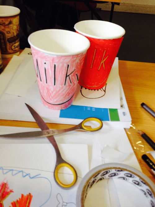
We had to bring our favourite font to the workshop. I brought Myriad Pro, an Adobe font that I like to use in websites. Very easy to read and quite elegant. Then we had to make a name for a coffeee company and use our chosen font as the basis for our logo. Later in the day we would incorporate this into a coffee cup design.
My company was called Milky. Starting with a font was great as I just copied it out a couple of times to get warmed up and then started adapting and playing with it: figuring out the existing rules and making new ones. Steve was a diplomatic teacher “yes, it’s good to go there to see how far you can push it…and then you can go back”.
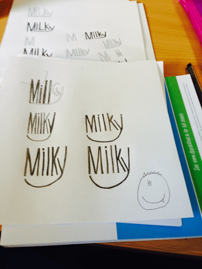
I ended up with a happy logo.
So it was a great day with an easy format. It loosened up my approach to hand lettering. I have so much to learn but at least I feel I can tackle it a bit better now. This week in MATS we had to do some hand lettering for my kids story book cover so it was good timing. See how I got on here.
See pics from the class on Steve Simpson’s Facebook page here. Thanks Steve!