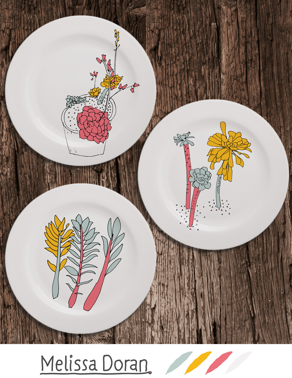
 I’ve just completed the second week of Lilla Roger’s Make Art That Sells (Part A) online course and I really enjoyed it! This week focused on the homeware market and we started with a mini-assignment drawing Bromeliads.
I had some photographs from a visit to the National Botanic Gardens last year and I started with them, as well as sketching from some images I got from internet land. The start of the week on the course is pretty chilled out and is designed to be a sort of play time where you can practise your drawing, experiment a little, but mostly build up some resources to draw from later on in the week when we get our big assignment. I find this method really good for freeing up and as Lilla says “giving chance a chance”.
During the week we can read and watch interviews with people who work in the industry, both the buyers and the illustrators. After we submit our piece there is a video review where Lilla picks a selection of work (there are about 180 students in the class overall so individual feedback would be impossible). The review is very positive and it’s really good to see examples of excellent work, and why it works so well. After watching the review for last weeks work I felt that I was too conservative with what I did and maybe didn’t make it unique enough, even though I still like my final piece.
Sometimes I try to be good instead of having fun so that’s something to watch out for next week!
Homeware Market
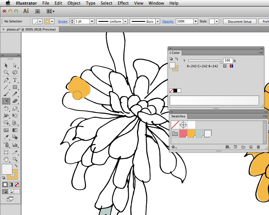
I used the same process as last week, sketching on paper then scanning> adjusting colour> live trace> and colouring in with the blob brush in illustrator.
Colour Mode
Sometimes if you do a live trace on an image in black and white mode, when you go to colour the image you can only get black colours despite choosing another colour. This is because Illustrator thinks you want to keep the image in black and white mode. To rectify this, go to the colour panel (window>colour) and open the flyout menu (top right corner) and change the mode to RGB.
Global Swatches
For this exercise I limited my palette to 4 colours. Once I settled on the four colours I made a new folder in the swatches panel and saved them here by dragging each colour from the toolbar into the swatches folder. It can be a good idea to make these swatches global. This means that if you later decide to change the colour of the swatch, all the colouring-in you have already done and associated with the swatch, will automatically update to match the new colour.
Once you have the colour in the swatch panel, make it global by selecting the swatches > go to flyout menu in swatches panel > swatch options > click on the “global” tick box. You can see that your swatches are now global because they have a white triangle in the bottom corner of the swatch.

Blob Brush
I love the blob brush! It gives a flat colour. When you click and drag then release, then click and drag again, all the coloured area blobs together and you get one outline path with a fill.
Once your drawing is ready to be coloured in, lock the layer it’s on and make a new layer (click new layer icon at the bottom of the layers panel (window>layers)). Drag the new layer beneath the locked drawing layer and colour in on the new layer. This is so that you can still see the lines of your scanned in artwork over the colour. Select the blob brush from the tool panel. Make sure you have the colour selected as a stroke.
Brush Size
Adjust the size of the brush on the fly by using the [ left square bracket to reduce the size and the ] right square bracket to increase the size. Make sure you are well zoomed in so that you can see what your doing (cmd + on mac to zoom in or ctrl + on pc; cmd – to zoom out on mac, ctrl – on pc). Use the spacebar to pan.
Product Mock Up
Once happy with the design I moved to Photoshop to finish the mock up. Ingrediants: image of table, image of blank white plate, + your design. I made a new document, placed the table texture image, then the plate, now I’m ready for my design. Back in illustrator I copied my design (my plate drawing with the circular plate background) by going cmd c (ctrl c if you are on a pc). In Photoshop I went cmd v (ctrl v on pc). Photoshop asks if I want to paste as smart object, say yes!
I then resized the image and placed it.
Blend modes
Now you see the image on top of the plate. Select the image layer in the layers panel and go to the blend mode section (drop down menu above the layers name, in the layers panel) by default it will say “normal”, change this to “multiply” and now viola it looks like the design is printed on the plate!
Next week
Come back here next week when I can tell you about kids books, probably my favourite market!
Bonus Guess-what
My work was chosen by Lilla to be reviewed so I was delighted. She suggested I re-do it with two more plates like the potted plant (top left one). So I will take that on board and re-do as soon as I get the chance. :)
See also : Make Art That Sells Week 1