Animation Skillnet organised a workshop with Annie Atkins, who is a Dublin based graphic designer famous for her work on the Grand Budapest Hotel, The Tudors, and Penny Dreadful amongst others.
I’d love her job, except for the hours…My other half works as part of the location crew for film and tv and he’s always telling me funny stories about working on a film set, so I have an above average knowledge of location matters, but it was cool to find out more about how a graphic designer contributes to the project.
Everything in films that has graphics needs to be designed. So if you see posters, receipts, notebooks, paperwork, etc in the background it gets designed first especially for the film. And even if you don’t see it but it’s used by the actors, it also has to be designed well to help the actors become immersed in their fictional world or era, and help them do their job.
Annie talked us through her process and gave us insights into the workings of the different productions she worked on. Once she gets the script she breaks it down into the different graphics required for each scene, and a description to go with them, if they are mentioned in the script. Then she starts researching the era and gathers references so that whatever she makes will be authentic and believable.
The most important thing is to try and get inside the mind of the character and their space in time. What would they choose to have on their walls, how would they write, what would be in their environment?
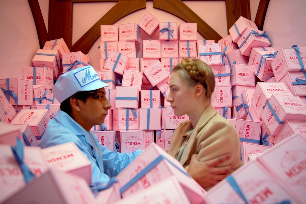
Grand Budapest Hotel
Watch this clip from the Grand Budapest Hotel and think about what graphics are needed in this scene.
The obvious things are the beautiful pastry box and then the map. I want a Mendl’s pastry! The map is drawn on the back of some packaging; on the package is some postage stamps from the fictional Republic of Zubrowka. The stamps bore the image of the fictional emperor of the land, then there was the franking stamp, and the address handwriting. What type of handwriting would there be? Is the spelling and punctuation different in this era than it is now? And this research and drawing just for a second on screen before it’s turned over to reveal the beautiful map of the prison to help plan for breaking out. So much detail is needed to keep in keeping with Wes Anderson’s vision but that’s why it’s so good. One small, inaccurate detail and the spell is broken.
Then once you make this beautiful thing you have to make more copies in case something happens the first one, or it gets wrecked, or if it gets taken out smooth and then becomes crinkled, you will need to allow for many different takes.
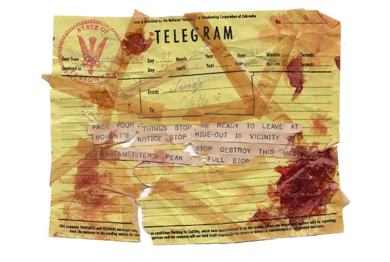
Bloodstained Telegram from Grand Budapest Hotel
Penny Dreadful
I work on Dame Lane in Dublin, where Penny Dreadful had a location last Spring, and we saw it transformed over a week into a Victorian London laneway. One of the most striking pieces on set was the stained glass signage over Sweeney’s pub, which we learned about in the workshop. Annie designed the lettering by hand, in keeping with the techniques used at the time. There was existing stained glass there so the “Grand Giugnol” name part was added to what was already there, and the same colours and background pattern was used in the new part so that it looked like it belonged there.
It was then created with the help of a laser-cutter, the perspex was coloured in by sign-painters and metalworkers made the structure.
Look at how Dame Lane was transformed here.
Workshop
During the workshop we went learnt how to approach a graphics treatment of a script, we tried out some calligraphy, stamping, and aged a document with tea. Was fun!
Visit Annie Atkins’ Website here.
Related Reading:
Hand Lettering and Design – Workshop with Steve Simpson
Etching Workshop with Debora Ando
Pattern Observer webinar: The Importance of Developing Collections